By Christie Atkins, Marketing Lead at POWERSHiFTER.
Women have experienced health inequities in BC for decades, and recent research conducted by the BC Women’s Health Foundation found that the COVID-19 pandemic is making them worse.
A powerful report surfaced startling statistics about gender-based violence, workplace exposure, isolation, job loss, and increased caretaking responsibilities resulting from the virus. To generate awareness of the impacts on women’s health, the data needed to reach a large audience fast.
But in today’s attention economy, multiple products and services are concurrently vying for our attention. Not everyone will download a full-scale report and consume it line by line. The team needed a creative way to attract readers, digest the information quickly, and empower people to take action. “2020 was a time of movements,” says Gord Brown, Senior Designer and creative mind behind the project. “We wanted to start a movement around women’s health.”
Art Direction
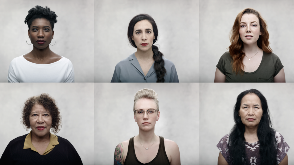
Gord, POWERSHiFTER’s Senior Designer, has worked with the BC Women’s Health Foundation since 2018. Originally brought on to bring their new look to the digital space, he also lent his expertise in art direction, co-producing award-winning photography that has since become a crucial piece of the Foundation’s brand. Therefore, its team was keen to follow his guidance for its latest project.
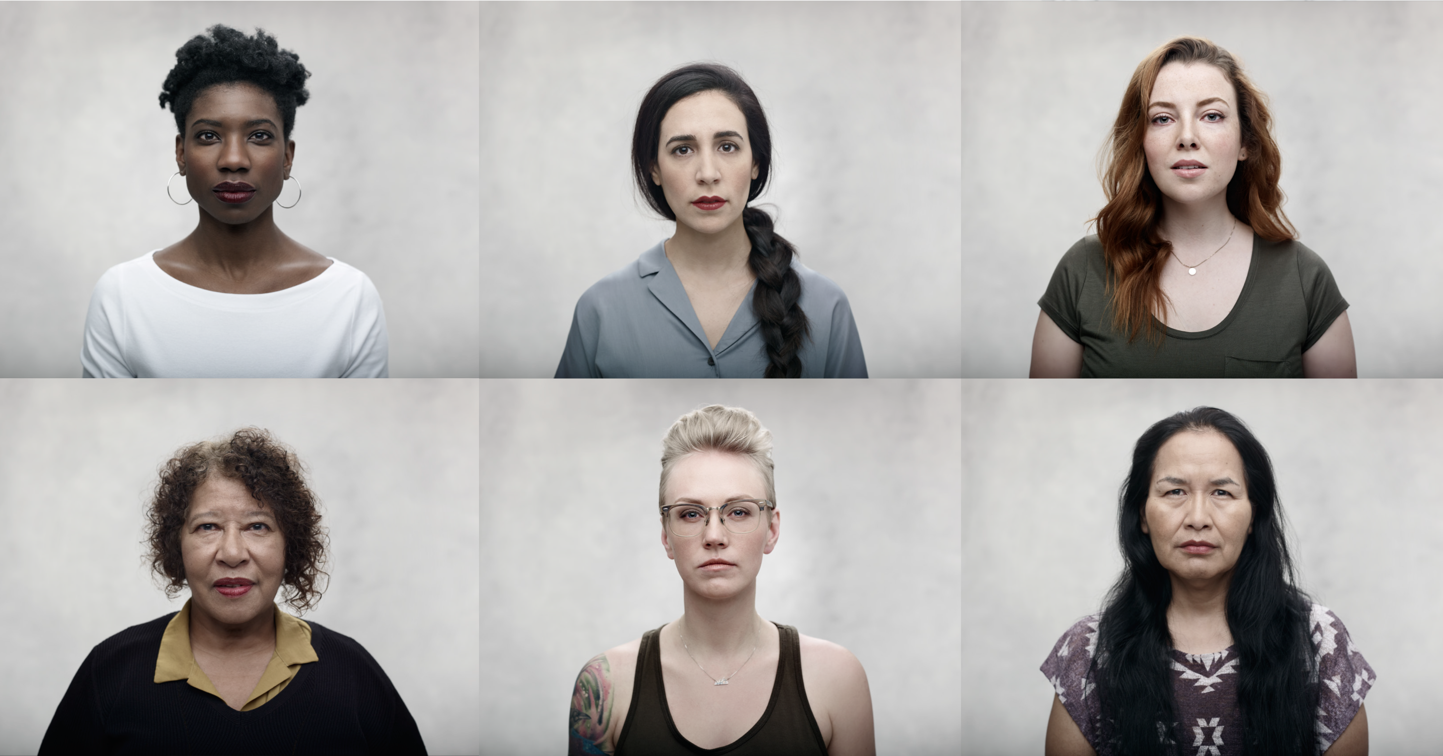
“We sought to transform the comprehensive report into a microsite, filled with easily digestible facts and interactions that made sharing across social media easy,” says Gord. “As an extension of BC Women’s brand, we used their bright colours, bold typography, white and blackspace, and thought-provoking visual elements to intentionally draw in and hold the attention of visitors.”
Deconstructing the Elements
Translating elements from print to digital can be complex. Not everything that works on paper is a perfect fit for the digital space. To start a movement and make a real impact, everything on the microsite had to be big, bold, and purposeful.
Colour
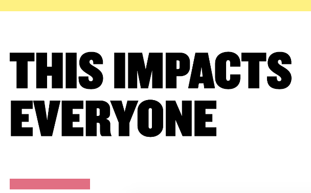
Pink and yellow are the bright, memorable colours found throughout the microsite. Yet, it’s the subtle use of black and white that provides balance and space for visitors to process the content. Akin to reading a book, Gord says the whitespace is like turning a page, giving the audience a breather and a moment to reflect as they scroll.
Imagery
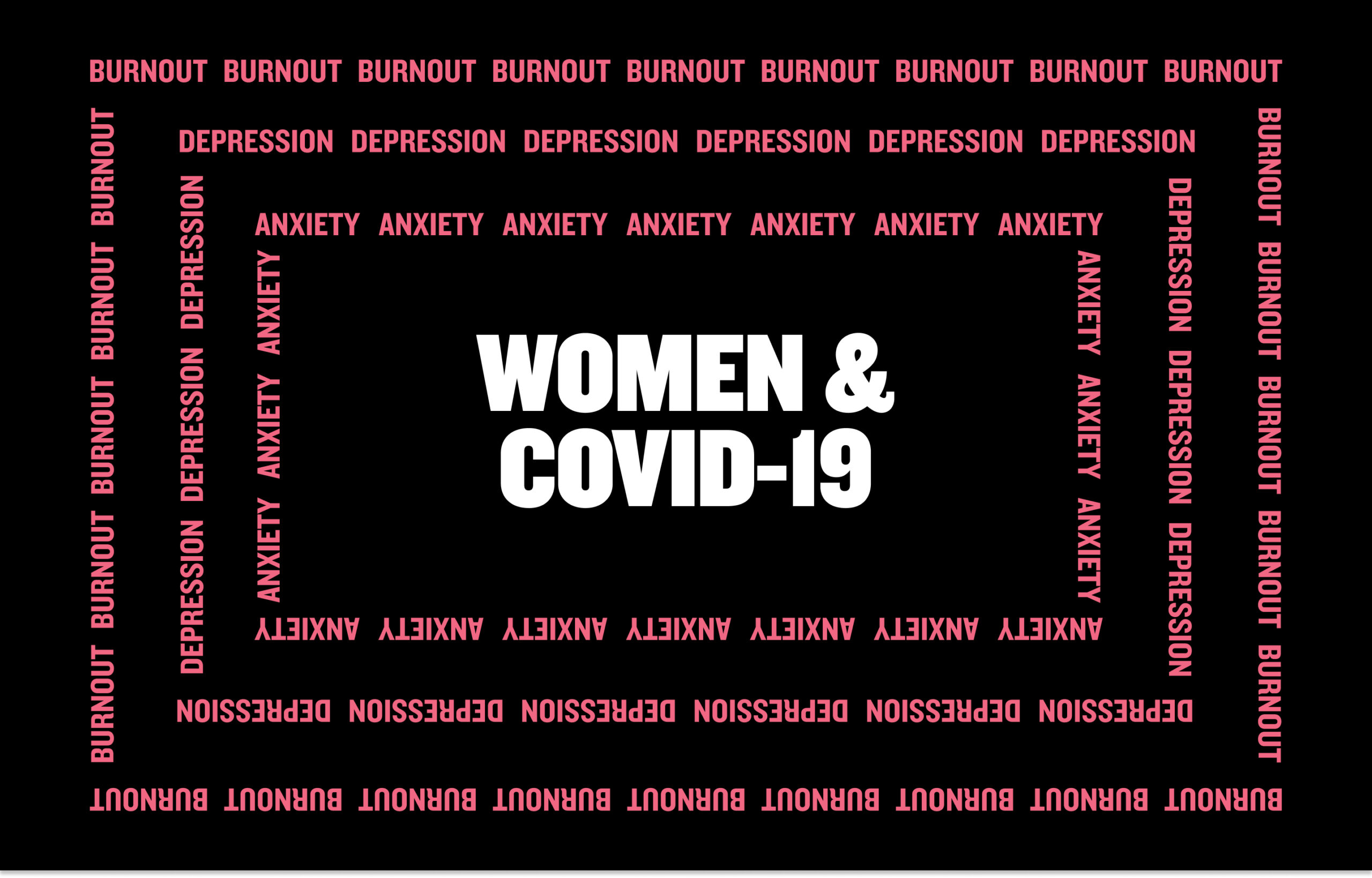
Anxiety, depression, and burnout were reported as the most common psychological issues women experience due to COVID-19. This visual represents the ripple effect caused by the virus and is seen throughout the microsite to convey the exacerbated inequity.
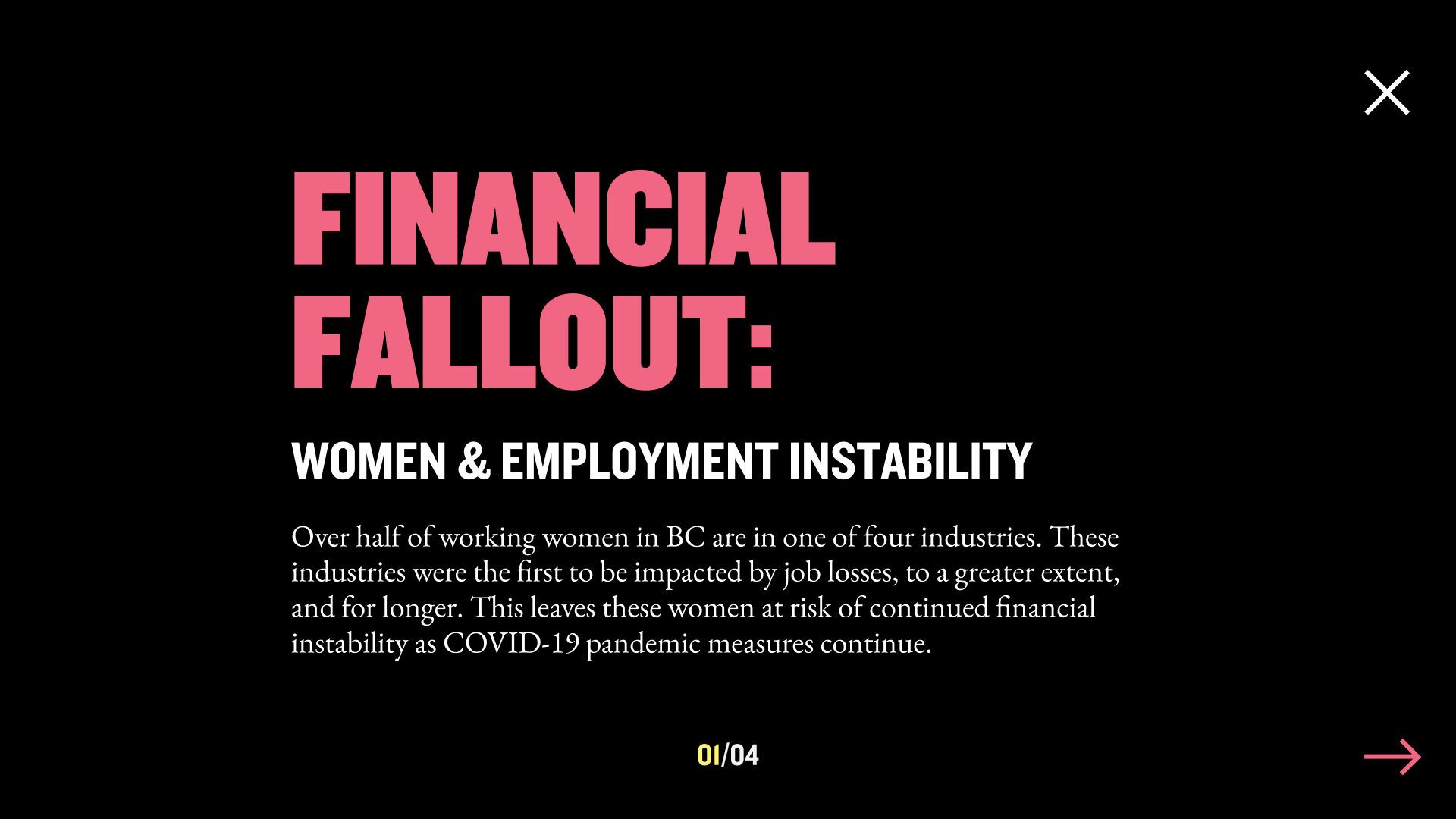
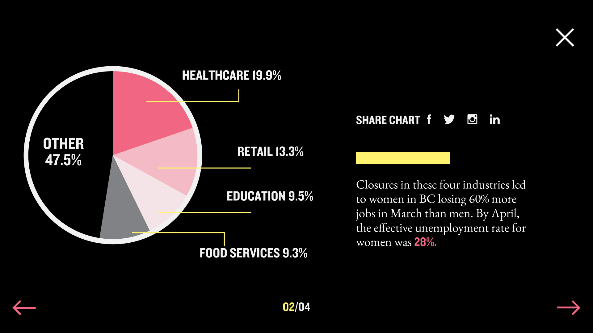
Financial Fallout, Risky Business, Safety at Home, and Unsustainable Support represent four facets of a woman’s life negatively impacted by COVID-19. Navigating to any of these categories initiates a viewport takeover where visitors can see the data. Intentionally placed numbers and graphs surface the most important and impactful elements of the report. Highlighting these content pieces in black and whitespace encourages individuals to focus solely on the text.
Social Sharing
To increase education and awareness of women’s health issues, disseminating information needed to be easy. Scattered throughout the site are buttons that enable visitors to post facts directly to their social networks or share their own stories.
Technology
No code/low code is a trend in the technology space. Our team had been looking for an opportunity to move in this direction, and ‘Unmasking Gender Inequity’ seemed like a perfect fit for the Webflow platform. We needed to have high production value, elegant animations, and speed to deliver. While there was a learning curve, the results were exactly what the team envisioned. So much so we became Webflow partners in the process.
Finding Purpose
POWERSHiFTER and the BC Women’s Health Foundation transformed a crucial report into an engaging and interactive digital product through creative digital design. By using award-winning photography, bold colours, captivating visual elements, and black and whitespace, we were able to capture visitors’ attention and communicate a clear message to the masses that we need change. The movement may be slow to start, but as more people visit the site, read the report, and champion equality, together, we are reenvisioning a future that better serves everyone.
POWERSHiFTER is a member of the Institute of Communication Agencies. Report on Marketing is where leading Canadian agencies showcase their insights, cutting-edge research and client successes. The Report on Marketing provides a valuable source of thought leadership for Canadian marketers to draw inspiration from. Find more articles like this at the Report on Marketing.
See all Ideas & Insights